15 Winning Acrylic Still Life Paintings

The Value in Still Life Artwork
Value is an essential tool on the hands of artists. It creates interest, mood, contrast and helps artists express what they want to say about their subject. Value provides an underlying structure to art — especially for those who paint still life artwork.
Here is a look at 15 of the best contemporary still life artwork, featured in AcrylicWorks 5 — which is all about bold value. Let these award-winning acrylic paintings inspire you to explore value more in your own art. Enjoy!
Flying High
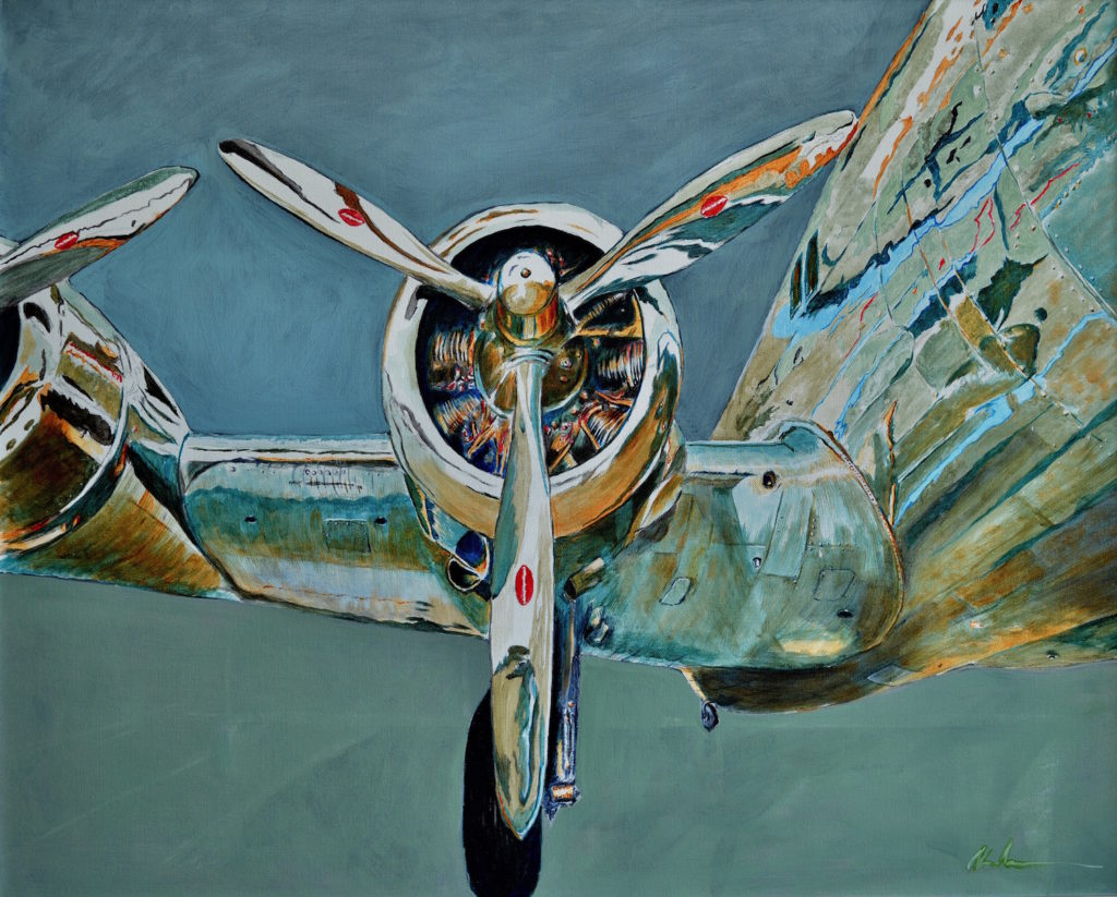
Boldness as a theme seemed intrinsic to painting aircraft and was what attracted me to this subject, not only in the values, but also in the highly specular, reflective surfaces. In the case of the Pan Am Cloud Clipper, its polished aluminum skin, while monochrome itself, reflects every color in its environment. I accentuated the bold, sweeping lines of the plane by choosing a tight composition to the left of the fuselage, which gives the illusion of the plane passing just over the viewer.
The plane is displayed in the National Air and Space Museum’s Boeing Aviation Hanger at the Steven F. Udvar-Hazy Center in Chantilly, Virginia. I worked from photographs in my studio, using the neutral background to emphasize the color and composition best.
–Thomas Mewborn
Shell Signs
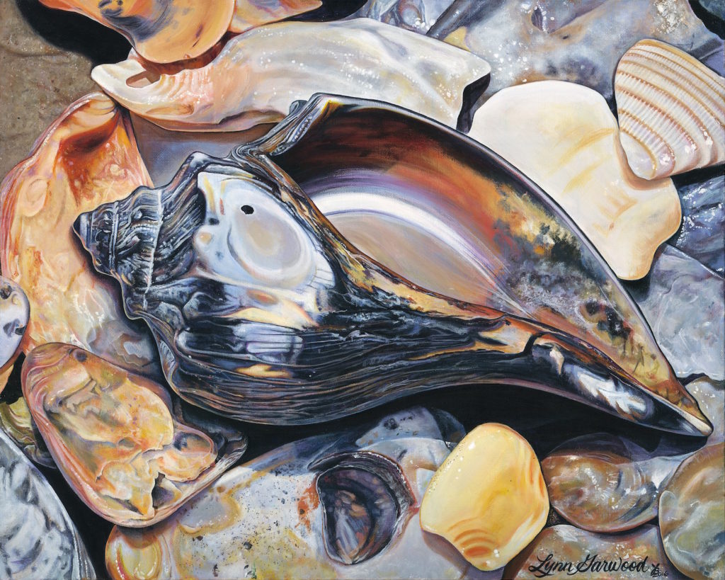
Magic Shell is a painting inspired by a very magical shell I found in North Carolina. As I was searching for a sign, a shell came rolling up out of the ocean. It was a “YES!” from the universe. I photographed it with some other beautiful shells and painted it in my home studio.
Positive words have a major impact on me. I begin each painting with a special word on the canvas. The word under Magic Shell is ageless.
I believe my art is alive, that all of my thoughts and feelings go into each piece. Each brushstroke is jam-packed with color, values and feelings. I allow my hand to freely express itself in my interpretations of my subjects. I love sharing my work with others and hearing what it brings out in them.
Vivid Boldness
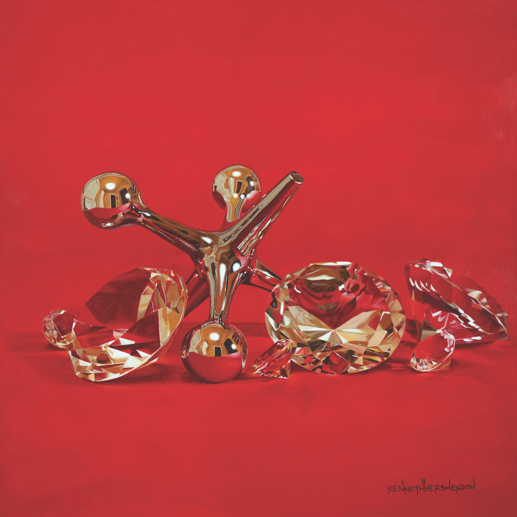
In Jack of Diamonds, I chose — as I often do with paintings in my I DO Know Jack! series — to create stark simple images with bold values to evoke hyperrealism. I choose lighting that creates strong shadows to give objects depth and a feeling that the viewer can grab the objects right off the canvas.
The vivid difference between the simple deep red background and the shiny objects makes the jack and diamonds pop. The interplay of prominent values in the construct of the diamonds and the jacks gives an almost liquid clarity.
The realism is directly attributable to these pronounced value changes. I use Golden OPEN Acrylics so that I have more time to blend the paint. This especially helped with the darks and lights of the diamonds.
Valuable Illusions

As a realist painter, value plays a huge role in my work. Value creates the illusion of three-dimensional form on a two-dimensional plane. From the initial concept to the setup and finally to the painting process itself, value is always at the forefront.
While setting up my composition, I continually adjust the lighting to ensure all the objects have well-defined forms and pleasing shadows. I am also very conscious of placing objects whose color and/or value will either create contrast or blend in with those around it in order to direct the eye throughout the entire painting.
One of the many things I love about acrylic is the ability to apply thin glazes to adjust both the color and value of the objects in my painting. It’s amazingly easy to adjust values with this technique using acrylic.
Fall into Color
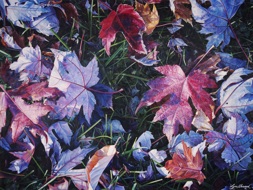
Leaving is a celebration of my favorite time of the year in the Midwestern U.S.: autumn. Bold, beautiful colors are freely given to us in abundance. For this particular piece, I stretched the large canvas. I painted gorgeous natural colors all over the white surface, then I painted the word LOVE across the entire canvas.
Positive, beautiful words inspire me so much. I was in love while I was painting this piece. I love how a glint of color off of a leaf makes me feel excited, so I included many of them.
As an artist, I can exaggerate colorful values and bring them out so much more than seen in nature. My wish for all who view this is to feel love in your own lives!
–Lynn Garwood
Play Ball
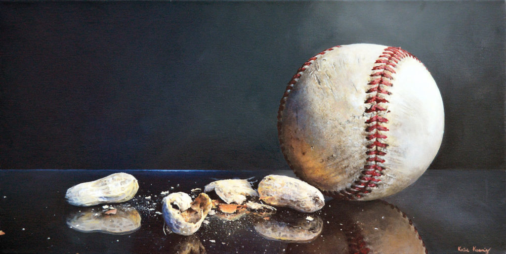
I work from photographs, which allows me to capture the details of a composition. It also helps me focus on value as I can adjust the light source to create a variety of darks and lights.
Acrylic paint is a perfect medium for working in small sections, applying thin paint layers to build up color and value. The dark color is typical of my background of choice. I use cooler tones in the shadows of the subjects and warmer tones to help bring the highlighted portions forward.
A full range of values with high contrast adds drama to the painting. The dark, but simple, backgrounds and well-lit subjects coupled with a realistic style are meant to be interpreted like a highlighted memory, hopefully evoking the remnants of a viewer’s baseball memories, without the specificity of a time or place.
Modern Meets Traditional

The Old Masters used exaggerated value relationships in their works to create depth and mood. I employed this philosophy in Soiree alla Prima as a modern take on their traditional techniques. The strong value contrasts provide enhanced differentiation between the forms on the table and surrounding space, while the subtler value variances lend structure and volume to each object. The overall value priority helps accentuate the patterns, and the color temperature complements the different forms represented here.
From multiple photographs, I sketched this scene directly onto a gessoed, splined canvas. I painted it with a limited palette of eleven heavy body acrylic colors using liquid acrylic polymer emulsion as my only medium. I like the painting so much I did not want to sell it.
Unity in Color
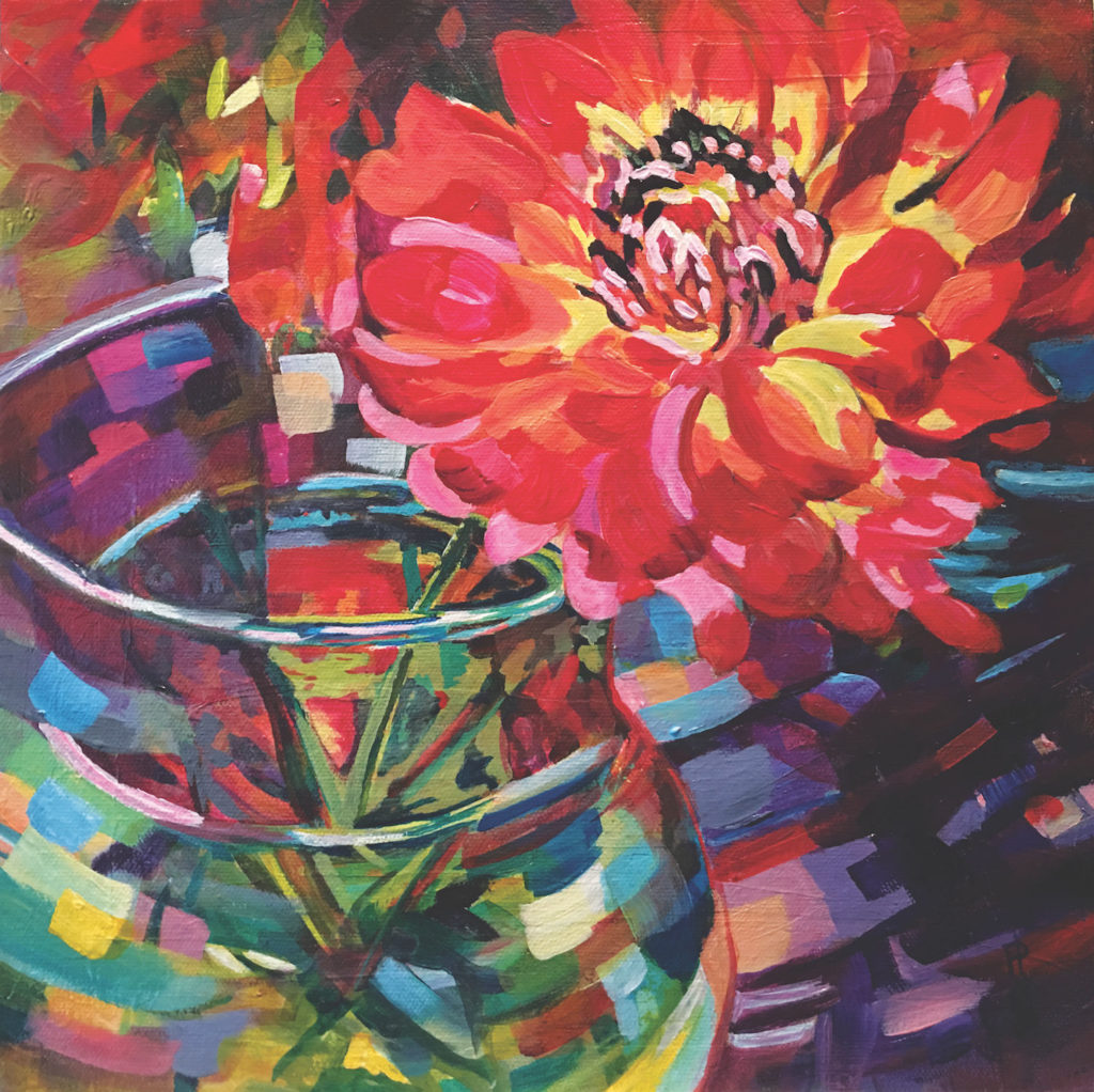
The light hitting my kitchen table created high-key values on this dahlia, which begged me to capture the joy radiating from it. I converted a photo of it into a monochromatic acrylic study on canvas. From that point, I could either choose to create a new painting on another canvas or, since it’s acrylic, paint directly over the study. I chose the latter.
The painting captured the photo yet somehow lacked unity. To solve this problem, I applied bold brushstrokes and a unifying color scheme that enhanced the direction of the composition to reveal my painting, Kitchen Table Dalliance.
Dramatic Contrast
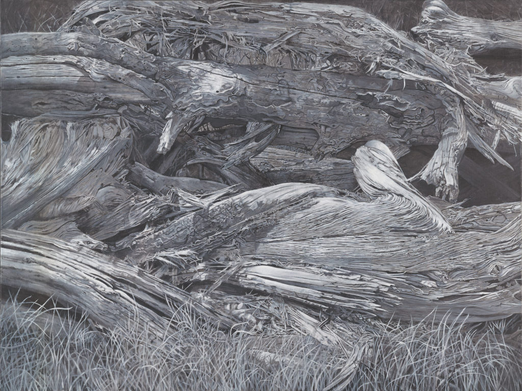
This painting is part of a series I am currently working on. It was based on photographs I took of wooden barricades in Canyonlands National Park in Utah. I decided to use only black and white acrylic paint because I felt color might weaken the dramatic effect of the wood’s nuanced surfaces.
By taking away color, I was able to concentrate on the minute details, composition and brushstrokes, which gave me a complete understanding of the bark’s fascinating textures. I painted values intuitively as I went along, contrasting darks against lights to create visual interest while establishing the illusion of depth. I intentionally used a light value to draw the viewer’s attention to the piece of wood that looks like a bird, creating a focal point.
Imprinted Picture

This painting was born from a suggested theme: imprint. This word kept running around my head until it landed on the shores of La Gaspésie, Quebec, Canada. This visual revealed itself and my eyes could not move from the ground, and I forgot the sky! The composition was imposed on me by nature, in a state of grace facing the sea. I abdicated, my picture was there.
My subject, captured in the light of day, meets the exact values of shadow and light. It is these contrasts that bring out my main subject: the vestiges left by the sea. The simplicity of the painting, of its elements and color, creates the illusion of detail due to the splatter technique used on the background. Acrylic lends itself perfectly to this technique.
–Jacynthe Comeau
Weathered Approach
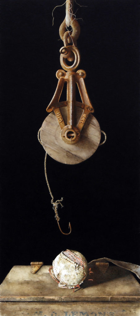
As all of the elements in Final Catch are aged and muted, it was vital to have the background value dark to create as much contrast as possible. This was particularly imperative with the twine hanging from the pulley and the codfish hook being so thin.
Initially I was trying to mimic Mother Nature by weathering a softball by repeatedly throwing it hard against a cement floor, to no avail. My physical therapist, who is also a high school baseball coach, knew I was looking for a weathered ball of some sort and found this baseball near-buried in the out-of-bounds ground near a ball field.
I adjusted the value and color of the antique cigar salesman box the ball is placed upon to resemble that dirt and grit of a home plate. It was necessary to place everything dead center, breaking the rule of not placing subjects that way. Occasionally, this rule has to be disregarded.
Landscape Reflections

Painting in a photorealistic style as part of my Reflections in America series, this piece was created with a sensitivity to bold contrasts in reflected light and color. I was approaching a traffic circle in Sedona, Arizona, and in the bright sunlight was a shiny black 1957 Thunderbird. A perfect surface to reflect detailed, bold contrasting objects.
Pulling into a parking lot, I followed and approached the driver with my digital camera. Twenty minutes later, after 50-plus photos, I had enough reference material to create a bright-contrasting natural landscape reflected in the dark lustrous surface. Starting with the darker values, I applied layers of acrylics from an opaque underpainting to translucent washes of pure color in order to achieve the ultimate results.
Deflated Values
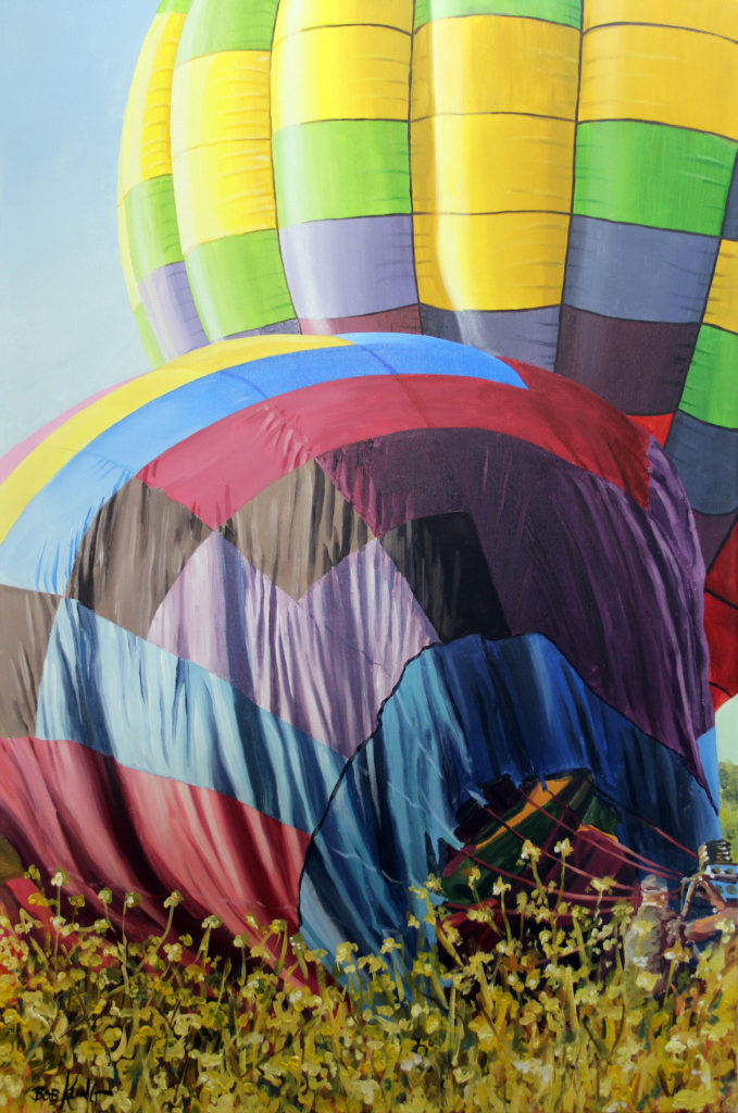
While flying with a balloon pilot friend of mine during the National Balloon Classic, we landed in a grassy pasture. Several other balloons also landed in this area, so I quickly hopped out of the basket and was able to capture a photo of one of the balloons deflating. I had been looking for an image of a balloon in the tall grass as it deflates since it creates such a strong value contrast in the folds of the envelope and a textural contrast between the fabric and the weeds. To take advantage of the bold value contrast. I also wanted strong sunlight.
I began by sketching and transferring the image to canvas. Working from background to foreground, I painted directly onto the canvas, starting with the yellow, green and violet sections on the far balloon. When that was complete, I scumbled and glazed in the bright highlights.
Although I work in both oil and acrylics, I find acrylics are more suitable to geometric shapes of color because of their quick drying time. I used roughly the same procedure on the second balloon. I then gently scumbled more shadows and highlights across the folds to unify the individual balloon sections.
A few thin glazes of Transparent Yellow helped portray the golden, warm Iowa sunshine. I enjoyed the freedom and looseness of the weeds and grasses because they provided a nice contrast to the bold geometric fabric of the balloon. I used a basic pointed round brush with simple strokes for the grass blades and the side of the brush for the weed blooms.
The Icing on the Cake
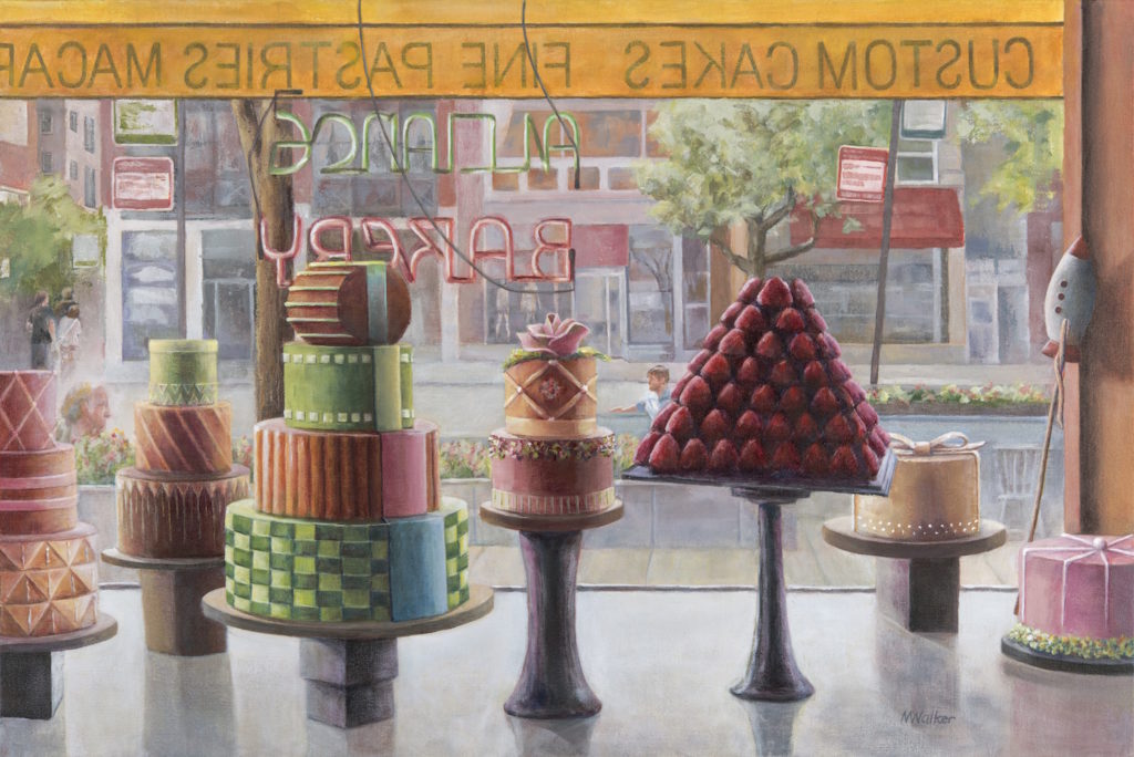
The focal point of paintings is often defined by bright areas. I chose to do the opposite in Alliance Bakery by making the objects of focus the darkest part of the painting. The high-key background and bright countertop provide contrast to the cakes, which are portrayed in darker and more saturated hues.
The background is somewhat out of focus, adding visual intensity to the more defined foreground subject. Finely detailed texture in the icing is made vivid with backlighting. The dark vertical cake stands and their shadows move the eye rhythmically across the painting, and a limited palette provides a unified feel.
Demanding Attention
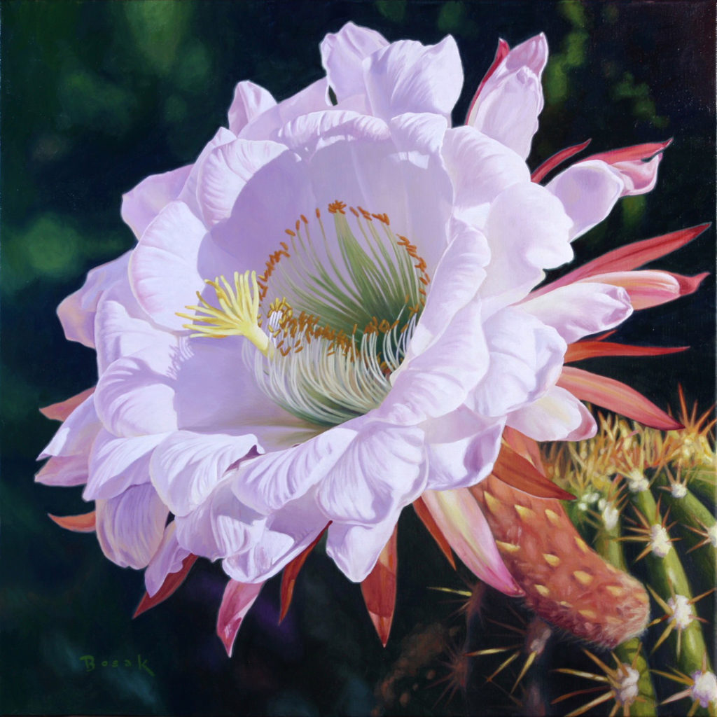
This flower was blooming in my neighbor’s front yard. I tend to paint a subject that commands attention and Fleeting Beauty, with its contrasting values, gave me no choice but to paint it. My canvas was undercoated in a neutral gray that I then transferred my subject to using the grid method. I use an acrylic that has an extender, which gives me the opportunity to work the paint longer.
When I start painting, I will work from the top left of the canvas down to the bottom right. I worked with a limited palette of Cadmium Yellow, Ultramarine Blue, Crimson Red, Magenta and Titanium White. I adjusted the colors and values as I went, finishing each portion of the painting before moving on. The background was the last thing I did, going back and tweaking a few areas to finish the piece.
Learn more about the AcrylicWorks art competition here.


Have a technical question?
Contact UsJoin the Conversation!