Interview With Jimmy Wright: Turning Toward the Sun
This article from The Artist’s Magazine by Robert K. Carsten first appeared in the June 2007 issue, available as a single-issue digital download or within The Artist’s Magazine’s 2007 Annual CD.
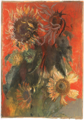
Jimmy Wright’s vibrant and expressive sunflower paintings are in many noted collections including New York’s Metropolitan Museum of Art. Recently a visiting artist in the fine arts department at American University in Washington, D.C., he curated with David Sharpe “The Anxious Image” at the Painting Center in New York City last year. For nearly two decades, this master oil and pastel artist has worked with the sole subject of sunflowers. At the end of last winter, we talked about this lustrous and powerful series.

How did you come upon your signature subject of sunflowers?
It was all pragmatic. I was taking care of someone who was critically ill, and it was completely consuming. I was thinking about how I was going to be a caregiver and still preserve something of my creative self. One day by chance I brought home a large sunflower head that was being sold for seed at a farmers’ market, and I decided to use it as a subject. The thought that it wouldn’t move, that it would be there waiting for me no matter what, was appealing. I hadn’t painted from a model since college, so I made a box with a grid window—thinking that this would give me some kind of orientation. The grid didn’t work very well because each time I moved, it shifted. But what did work was this sort of proscenium with a transparent grid across the ‘stage’ and a giant sunflower behind it: It was all quite magical. The sunflower paintings that I made turned out to be successful. I felt a sense of relief that I didn’t have to think about what art is. I had an object to paint, and the work was entirely based upon formal decisions. At least that’s what I thought at the time.
So how do you begin one of these sunflower paintings?
I may have a beautiful bouquet of flowers set up on a tablecloth, as well as dried flowers that are laid out on a long table. I will also have photographs of details of flowers that I’ve taken and perhaps a postcard of a painting, a Gauguin, for example.
So you’re working from multiple sources and in a sense internalizing them during your painting process?
Yes. For me, all picture-making proceeds from a formal basis. By formal basis I mean all those physical, visual signs that make up a painting such as color, value, form, etc. I don’t consider myself a realist because a realist will sit in front of a still life or a model and try to render what he sees. With me it’s always, Well, that large shape on the right side is wrong, and no matter how beautifully it’s painted, I have to wipe it out. I have to find the composition, and if something’s not working, I’ll rotate the painting around and work on it. So I’m not always working with a set top and bottom, left and right. I’m making a painting, not a reproduction of what I see.
Although you’re an oil and pastel artist, one of the qualities that’s so strong in your paintings is your draftsmanship. How did you develop your drawing skills to such an extraordinary level?
When I was very little, I would walk around and pretend to be painting in the air. I was learning how to visualize. In school I was always the class drawer. When I was about eight years old, I declared that I was going to be an artist. This was in Kentucky on a farm, where there was absolutely no family precedent. Years later, I spent the summer with my aunt and her husband in Denver. She paid for art lessons for me, and as serendipity would have it, the teacher, Lester Burbank Bridaham (1899–1992), had been a student of and monitor for Kimon Nicolaides (1892–1938), so the first thing we learned was how to capture dynamic movement through gestural expression, which you can see is pervasive in my work. Like practicing a basketball shot, we were taught to coordinate the hand and the eye. Back in Kentucky when I started college, my freshman drawing class was also based on Nicolaides’s book, The Natural Way to Draw. This class honed my skills and gave me the discipline I needed.
Does your use of relatively large formats contribute to this gestural treatment of form?
Yes. Even though it’s physically demanding, I like to work large. Working large allows me to draw with my arm rather than my wrist. A line that’s “alive” makes a figure that’s alive and strong. Janet Fish once said to me, “I love that you always have motion in the piece.” The forms tend to become metamorphic and contradict the fact that they are still lifes.
In particular sunflower paintings you create wonderful areas of loosely associated lines which then evolve into hatchings and crosshatchings and eventually into fully realized form. Is this part of an intentional process?
Intentional in that all the tools at hand were working, all the things I was trying to consolidate just came together. Sunflower Head No.5 (below) was the first one where I became aware that the marks came out of a place I’d never been before.
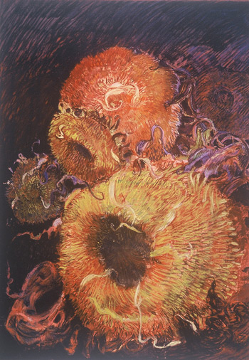
While everyone’s initial reaction was to note a similarity to the strokes in a Vincent van Gogh, instead the marks reminded me of chalk drawings by Jean-Antoine Watteau in that they had a rhythm, a certain stylistic invention. As a student I had a wood engraving class, where I intuitively learned when to leave a black line around a white area to define it and when to cut away the line into black. Early engravers who made plates for printing presses were taught this as part of a trade. It’s the same thing you can see in a William Hogarth or a William Blake. It’s all in how you define the form with the marks. In a sense, I was learning figure/ground relationships. In Sunflower Head No.5, there was this unconscious rhythm established. It was a watershed piece.
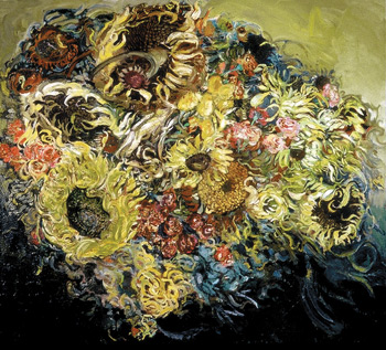
In Sunflowers, Yellow (below), we can see another way in which you work with figure/ground relationships.
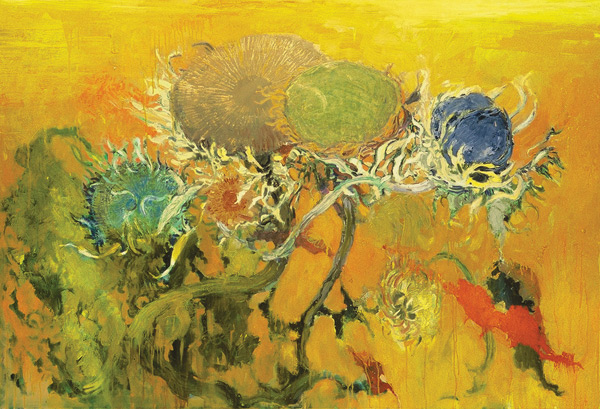
In parts of the background, the brilliance of the yellow paint reminds me of gilding on a Byzantine work yet, around the stems and leaves, the yellow starts to dissolve the edges of forms. In other places you’ve allowed the paint to drip so that everything becomes surface, negating the illusion of depth. Can you elaborate on this?
One of the ways I use space is as a bridge between abstraction and realism. The drip snaps the eye back to the surface and reminds the mind that this image is only a reverie made of paint. The drip keeps beauty at bay, preventing the image of flowers from becoming a kitsch sentimental bouquet.
Sunflowers, Yellow was one of the works I did for my first exhibition at DC Moore Gallery. I was consciously trying to bring my oil paintings to a point that was equal to my pastels. I had to solve how to manipulate the paint so that I got a similar feeling to what I was already achieving in pastels. One way was to dissolve the form and let the paint go from being very tight to very loose.
Your use of color is absolutely stunning! How do you achieve this rhapsodic color?
Usually, I start off with the color being totally arbitrary. I’ll think, Oh, I’ll use blue, or Oh, I’ll use red. My color is disassociated from my subject. I just start working with it, and then, as with the composition, I have to find chords to orchestrate the color. Again, I’m not referencing the object; I’m referencing the painting as an object.
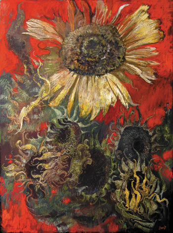
My first pastel sunflowers, however, were monochromatic. Then I did some where I added an Indian red. One day I tried one where there was color everywhere. That was the change; it was an epiphany. It goes back to when I was a student at the Art Institute of Chicago, when I would wander through the museum and look at works by those wonderful French painters like Pierre Bonnard and Odilon Redon. When I matured, I had the pleasure of rediscovering them and their staggering use of color. At the Institute I had a class using the color theory of Joseph Albers. Enacting the theory was concentrated and extremely tedious, but I came to recognize the multiplicity of the power of color. Albers’s own painting method was one in which he didn’t physically mix colors; instead, he bought different brands of the same color so, in a way, what he was doing is similar to working in pastel.
Speaking of materials, what brands of pastels and oils and which surfaces do you prefer?
I used to start with Rembrandt or Girault pastels because they’re hard enough to be resistant to forceful handling, and I worked on unprimed paper. Now, I usually put a coat of Golden acrylic ground on Lanaquarelle paper, and I use many pastel brands. Each brand has its own physical qualities. Great American Artworks pastels are soft and velvety. Unison, Diane Townsend and Mount Vision have a drier, grittier quality. The reds in the Pompeii series are by Mount Vision. I love Diane Townsend’s terrages pastels—she made her first complete set for me. Although I’m not systematic about it, sometimes I use a fixative in areas that are unresolved. Using a fixative gives me a surface that I can go back and work on without smudging. I also use fixative when the work is completed.
My favorite oil paint is Vasari Classic Artists’ Oil Colors, made here in New York City. They are pure, consistent and archival.
Let’s talk about the narrative or symbolic elements in your sunflower paintings.
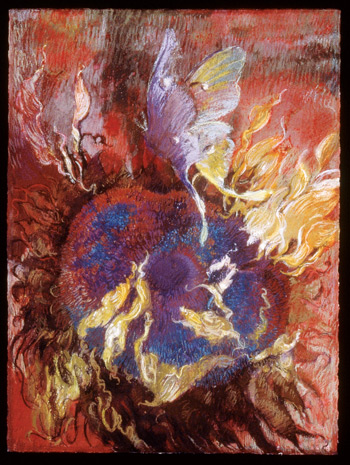
Narrative is instinctive to me. When I was a freshman at Murray State in Kentucky, I was interested in American writers like William Faulkner, Flannery O’Connor and Eudora Welty. Their writing was so revelatory. They gave me a reference for how I grew up on a southern farm; those novels and short stories are still very much with me. Faulkner, O’Connor and Welty all used symbolism, but it never overshadowed the storytelling. In a sense, these sunflowers have a narrative, but all the titles, like Moth to Flames or Raft of Medusa (both on page 52), come later. I don’t approach a work thinking, Oh, I’m going to do a moth and the idea of flames. Because I went to the Art Institute of Chicago in the mid 1960s, an important influence was surrealism: the idea of cutting a piece or symbol into disparate parts and then fitting the parts back together. Some of my sunflowers can be viewed as undergoing a metamorphosis to become figures.

Among your most recent work is the Pompeii Series. Can you tell us about it?
It’s a conscious series—and conscious in what is a new way for me. The quality is Pompeii, yet the subject matter is not Pompeii at all. In a peculiar way, even the first sunflower painting I ever did was a reference to Pompeii. It’s partly that on the walls of Pompeii are some of the earliest classical paintings. The wall paintings are decorative yet religious and full of symbols, though that may not be what the early Romans saw. The surfaces have deteriorated, and the color has changed. It’s like Christian symbolism in Renaissance art: We don’t read the paintings the way the original audience did. What interests me is that distressed surface. It’s similar to characteristics that can be achieved with pastel. Of course, in pastel the surface is porous and open. You’re working with pure pigment—in a sense, with earth itself. It’s exciting! I want to do a whole series with that red.
Learn More
- Read Jimmy Wright’s thoughts on pastel fixatives in this free online article.
- Download Pastel Journal’s interviews with eight great pastel artists.
- View a free preview of Claudia Seymour’s video The Art of Painting Flowers.
MORE RESOURCES FOR ARTISTS
- Watch art workshops on demand at ArtistsNetwork.TV.
- Get unlimited access to over 100 art instruction ebooks.
- Online seminars for fine artists
- Learn how to paint and how to draw with downloads, books, videos, & more from North Light Shop.
- Subscribe to The Artist’s Magazine.
- Sign up for your Artist’s Network email newsletter & download a FREE issue of The Artist’s Magazine.


Have a technical question?
Contact UsJoin the Conversation!