Fleshtones and Color Temperature

By Koo Schadler

There’s a simple principle for depicting beautiful, convincing fleshtones: Alternate warm and cool color temperatures. Nearly every painter in past centuries was attentive to this axiom, and it’s applicable no matter what the medium, working method or model. But before I delve into this tried and true approach, I need to explain traditional lighting. .
Duplicating the Sun
For millennia artists have used natural light to illuminate a subject. Sunlight is one-source lighting (versus, for example, a room with multiple light fixtures). Typical daylight also is balanced in the sense that it reveals both warm and cool color temperatures. To most people, the color blue appears cool while reds and oranges look warm. These correlations are known as “color temperatures.” Every hue on your palette has a color temperature, ranging from the coolness of cobalt blue to the warmth of cadmium orange. Light also has a color temperature known as “correlated color temperature” (CCT), and it’s measured in degrees Kelvin (K). Although the CCT of sunlight varies, painters of the past generally assumed or imagined a light source that was neither too warm nor too cool but somewhere in-between. They wanted the look of balanced illumination because that lighting best reveals a range of color temperatures. (See Before the Bulb, below.) .
BEFORE THE BULBWhen a light source steps outside the parameters of approximately 5000 to 7500K, it has a more pronounced color temperature, which changes the patterns of warm and cool described in this article. Did painters from the past consider lighting conditions outside the norm? Mostly they did not. Traditional painters did not simply chronicle the material world as it presented itself to them. They took subject matter from everyday life and then imposed upon it organizing principles of design. Paramount among those principles was the pattern of visual contrasts (varying values, chroma and color temperatures) created by one-source, balanced light. The subject matter, personality of the artist, tastes of the time and other circumstances might have influenced the expression of a principle. For example, a subject’s halftone might have been a green, purple or blue version of his or her skin color. Yet within these variations, the larger principle of “cool halftone” was maintained. |
Traditional studios relied on light from a north-facing window, but you can approximate this even, one-source lighting electrically by illuminating your subject with a single 5,000 to 7,500K CCT bulb (Balanced Illumination, below). .
Balanced Illumination |
|---|


One-source, balanced light creates predictable changes on a three-dimensional form as it makes the transition from light to shadow, as can be seen on a sphere (see Fleshtone Spheres, below). .
FLESHTONE SPERES |
 As light on a three-dimensional object makes a transition into shadow, distinct areas appear that define the sphere’s form. Teachers’ opinions vary on how many zones there are or what to call them. I think the four areas labeled in the above sphere are the most important and distinct. These designations are relatively simple to work with, yet sufficient to create convincing three-dimensionality. The area that tends to cause the most confusion is the halftone. Halftones aren’t fully illuminated, as are light areas, nor is illumination completely obscured in a halftone, as it is in deep shadow. The halftone lies between light and shadow. It’s a transitional area where illumination and darkness overlap. |
 |
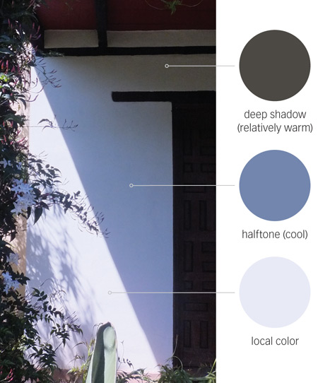
Most apparent is a progression from light to dark values. Local color (color unaltered by light or shadow) also is affected. It varies in purity, ranging from bleached out (in the highlight) to varying degrees of saturation in the light, halftone and shadow areas. The appearance of the materiality of the sphere changes too. Highlights and lights appear solid, an effect conveyed by opaque paint. Halftones and deep shadows look progressively atmospheric, suggested by transparent paint. Finally, there are shifts in color temperature. Under traditional lighting, the local color of an object alternates between relatively warm and cool versions of itself. The highlight is cool, the light warm, the halftone cool, and the deep shadow warm (see Shadows on the Wall, below). These color temperature shifts have important consequences for the depiction of fleshtones. .

.
.Warm, Cool Fleshtones
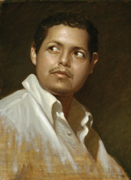
People often think of skin or fleshtones simply in terms of its warm, local color: various shades of pink, brown or black; however, because we live in a world illuminated by the one-source, balanced light of the sun, people also are familiar, consciously or not, with alternating color temperatures in three-dimensional forms. Fleshtones painted with only warm hues appears overheated or unrealistic. Including warm and cool versions of the local color of flesh helps it appear natural and convincing. These contrasts also create more beautiful complexions. Pink cheeks seem lovelier alongside a cool, greenish halftone, and the warmth of darker complexions appear more vibrant next to a blue or purple version of their local colors. .
Focus on the Halftone in Fleshtones
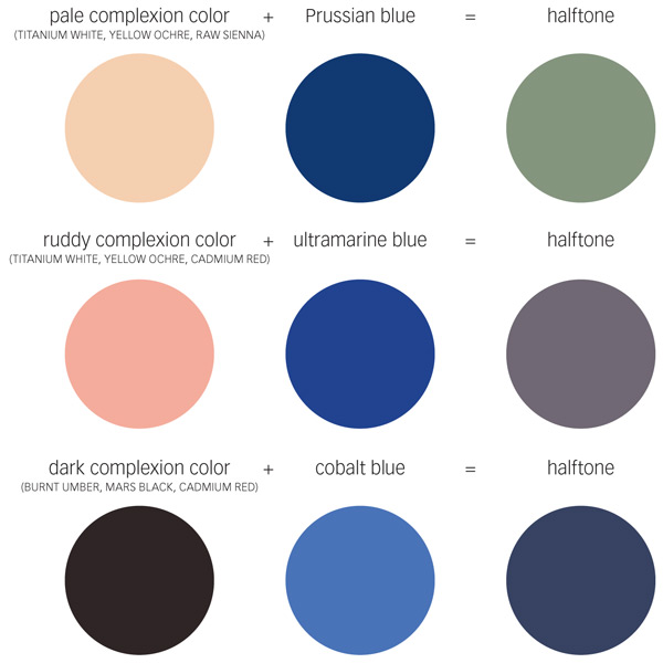
Alternating color temperatures within a portrait may seem complicated at first. To simplify the process, I suggest focusing initially on the cool halftone. Why the halftone? Highlights are very light in value and, therefore, depicting them requires white paint. Adding white to a color generally cools it, so highlights tend toward a relative coolness. There is also an inclination to render the light and deep shadow areas with warmth, since the local color of flesh is itself warm. In other words, the color temperatures of the highlight, light and deep shadow of fleshtones come more naturally to most painters. The cool halftone is the area with the most unexpected and, hence, overlooked color temperature. There are various ways to impart a cool temperature to fleshtones , but the simplest is to add a bit of blue to a subject’s local skin color. For fair-faced sitters, the result is a greenish halftone. In ruddier complexions halftones have a purple tint. In darker complexions, they might appear a deep blue. (See Just Add Blue, below). .

Once you’ve got the knack of imparting coolness to the halftones of flesh, the relative warmth of the light and deep shadow areas on either side becomes evident. You can glaze thin layers of warm, transparent colors, such as burnt umber or burnt sienna, over deep shadow areas to enhance their warmth and increase color-temperature contrasts. The results are skin tones full of life. .
Key to Visual Excitement
The Greek philosopher Heraclitus said, “That which is in opposition is in concert, and from things that differ comes the most beautiful harmony.” Traditional painting is commonly described as “realistic,” but it’s equally rich in contrasting, yet complementary, abstract elements. Warm and cool color temperatures are among the most important visual opposites. When you incorporate them into a portrait, you create both convincing imagery and visual excitement. .
See the free preview of Chris Saper’s video here: Painting Oil Portraits in a Cool Light.
A version of this article was published in the September 2015 issue of Artists Magazine.


Nice article, but wanted to point out that the example of the cast shadow on the wall is absolutely NOT a halftone. Halftones (and the concept of alternating temperatures) are applicable to FORM shadows not CAST shadows. The only reason the temperature is shifting on that shadow is because the corner of the wall receives more reflected light from the ceiling.